Showing posts with label 208:1:P3. Show all posts

Thursday, 11 November 2010

Black And white

As the weather looked good and it appeared the light was going to be OK decided to plan a trip into Birmingham. Principally wanted to look for good opportunities to produce some pics in a similar vien to those produced by Stoller.
Liked this pic as the perspective is clear and the tonal range and shapes are varied. There are several pictures in this one. Could have taken lower and used an upward perspective to add interest.The person in the distance adds scale to the picture.
Used ISO 100 with f/13 and exposure at 1/25
Chatting to Steve this pm he suggested comparison to Ed Swindon and the artist M C Escher. 


These are all Ed Swindons pictures. Somewhat manufactured ! But end result is good. Irrelevant detail is blacked out to focus on the main point of the pic.

ISO 100 f/4.5 with shutter speed 1/125
Internal of St. Phillips Cathedral. Slightly darkened but only to increase the intensity of the window shadow on the wall. Liked the resulting shapes and tones. Even the perspective works well to draw the eye into the picture.

ISO 100 f/13 Shutter speed 1/20 th sec.

Wednesday, 27 October 2010

Birmingham Buildings

On a bright morning this week, I decide to drive into Birmingham early for an appointment and take the opportunity to take a few building shots.
Being mindful of the tips and pointers I have picked up from my "research", I tried to incorpoate as much as possible or at the very least think about the set up before taking the shots.
  • Use of light
  • Perspective - either single or double
  • Focal point clearly defined
  • Shapes and colour
  • Composition and frames
  • Reflections
The first two pics are are the new road bridge over the M42 at Solihull. In both the perspective is good and the colours are well defined. Liked the shapes and composition of both. Used the shade on the footpath in the first and the central white line on the second to lead the eye into the shot. The symmetry of the second works well as does the square format pic.
10-24mm lens, ISO 100, F/18, 1/40th Sec

 
10-24mm Lens, ISO 100, F/13, 1/80th sec
 The next shot is the BT tower. Tried to get a different perspective with this and use the recess and purple detail to lead into the shot. The focal point is approx 1/3rd up the tower but the small apperture gives the focus all the way to the top. Possibly could have changed the orientation to read bottom left to top right. The bright white tower has "darkened" the sky to good effect.

18-55mm lens, ISO 100, F/22, 1/60th sec
Saint Paul`s Church spire. Tried to centralise and frame the focal point with the overhanging trees. Like the contrast between light and dark shades on the spire due to the sun light.
18-55mm lens, ISO 100, F/22, 1/25th sec

Interesting shot. Taken of the mirrored facade on Gt Charles Street reflecting the footbridge and the building behind. Possibly could have got people in the shot to bring it to life. The grid gives the shot depth and symmetry. Also the shaded footbridge contrasts with the bright building behind.
75-300mm lens, ISO 100, F/6.3, 1/80th sec
Cornwall Street. Recent building again tried to change the perspective to provide interest and use the reflections of the adjacent buildings and the clouds. The colours and shades are very bold.
10-24mm lens, ISO 100, F/13, 1/60th Sec

Rutland House. Again tried to use the reflectionsto create depth to the shot. The building  face was in shadow hence the greatly contrasting shades.
10-24mm lens, ISO 100, F/13, 1/30th Sec

Monday, 18 October 2010

Tips for better photos - Ex Heritage BC WebSite

PHOTOGRAPHING BUILDINGS

Tips for better photos

Getting Your Sharpest Shot

Sharp lenses and accurate films need your help if they're to deliver optimum results. Using a tripod will result in much sharper pictures than almost any handheld camera can produce. A tripod also helps you compose the picture carefully – you can make the fine adjustments to place the subject just right. With a tripod you can take indoor pictures without needing a flash.

Compose a Margin

If you're photographing a building to get an overall view, any outlines or features that are too close to the edge of your viewfinder may be cut off in the final photo. Use a wider angle lens or move back enough from the subject to give it some "breathing room". Sometimes it is easier to get a good building photo by moving a long ways away and using a short telephoto lens (be sure to use a tripod for any telephoto work). Compared to working closer with a wide lens, the telephoto will be less likely to distort the appearance of vertical lines.

Use the Right Light

If your subject is a building, it will look best in a picture if the brightest light is on the face or main entrance side. Compare early morning and late afternoon lighting. Strong mid-day shadows may obscure a lot of the architectural detail.

Direct sunlight may also cause the details of transportation machinery to be obscured. It's a good idea to use fill flash for these subjects, or try to reflect some light into shaded areas by holding a piece of 30" x 40" white matt board or a sheet of foamboard at an effective angle. A hazy sun often provides the best light for artifacts displayed outdoors, and this softer light is also recommended for photos of a building if its entrance faces north or trees cast "busy" shadows on it.

Try a Better Point of View

In photographs, the shape of buildings and artifacts is easier to see if the camera is aimed at a corner, rather than flat-on. A corner view provides twice as much information in one picture.

Convergence occurs in many building photos when the camera has been aimed upward, often from street level. The lens makes the vertical lines of the building tilt inward, much more than you would see just looking from that angle without a camera.

To achieve a less distorted effect in your pictures, try to set up your camera where it won't have to be tilted up too much to include the whole structure. See if you can aim from an upper level of a neighboring building, from a balcony, a stairway – any platform that brings your lens height closer to the mid-point of the subject will help.

Thursday, 14 October 2010

2 point perspective


The three photos below demonstrate the difference between 1-Point and 2-Point Perspective, as well as 3-Point Perspective. The first photograph (Fig. 1) is an example of one-point perspective. All of the major Vanishing Points for the buildings in the foreground of Fig. 1 converge at one central location on the horizon line. The angle of view or Point Of View (POV) in Fig. 1 is referred to as Normal View perspective. In Fig. 2 the vanishing points for the two opposing faces of the center foreground building project towards two different vanishing points on the horizon line. In Fig. 3 we see that the horizontal building elements project to the left and right horizon and the vertical building elements project to a central vanishing point in the sky. This upper vanishing point is called the Zenith. If one were looking down on the object from a Bird's Eye perspective, the vanishing point below the horizon and would be called the Nadir.


Perspective Types

1 point perspective Photo

Timothy Soar photography

Back at college now and continuing my research. Last time found this guy whose photos I like.

I am particularly impressed with his use of straight lines and symmetry. A trait at home with any Structural Engineer !
He seems to put great emphasis on the focal point of the picture being in the centre with the perspective being very central and straight.
The use of colour is usually minimal and subtle so as not to detract from the overall shape and form of the building. But where it is evident it servers to enhance rather than detract from the simplicity of the photograph.
The result is very simple but effective in emphasising the perfect form of the building without unnecessary distractions and clutter.


This pic does show the use of the central focal point and perspective.  The colour is simple and the lines are straight.
particularly like the lines on lamps leading into the pic. Just a shame there is not more of a main focal point. Single point perspective.
This pic is similar in so far as the symmetry, straight lines and focal points are concerned. But there is a well defined focal point leading into the scene. The use of light is good and creates an interesting array of shadows.

Here again the perspective is straight. But this time he has used the lack of colour to emphasise the simplicity of the shot. The composition works well as do the simple lines.

Here he uses the advantage of colour and the reflection of the elevations. But the theme of straight lines is constant as is the simplicity of the shot. I like the composition and the natural daylight adds interest to the overall pic.

Again the straight lines are evident but uses the light to add interest to the shot. The composition is good and simple with the main focal point being the chairs. The dark floor merely adds interest and contrast to the light colour of the walls. the only distraction is the plug sockets. Should they have been photoshopped out ??


Is this an external corner or internal ?? Either way it works. The composition is good and the perspective is good. The reflections work well to form interesting shapes and the colour adds interest to the shot. 


Like the use of colour and the perspective. 


This pic shows the principle of two point perspective and two vanishing points. Colour and composition are good and the use of light works.


Perspective and lines are good and straight. The vanishing points are strong and the use of colour works well.

Thursday, 7 October 2010

Reference this Guy

Timothy Soar Photographer
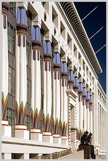
Another pic by Anthony Weller. Like the perspective of this and the angle draws your eye to the statues at the entrance. The use of colour is really good and the whites of the building is contrasted sharply with the darkness of the sky. Use of shapes is good

Newport Spire

This was the original photo taken by Onne Van Der Vaal. Photographer in Newport Rhode Island. Here the sky is much darker which brings out the detail on the spire. The image overall is sharper than mine but, interestingly the perspective and focal points are the same.

Dome


Back at College - 7th October 2010. Resumed the research of Anthony Weller. Really liked this pic. the composition is good and the eye is lead to the dome focal point by the use of the railings. The lighting is particularly interesting as it compliments the colour of the lighting bollard. the rule of thirds is abandoned as the main focal point is central.

Thursday, 30 September 2010

Conference Centre, Edinburgh

Spent the evening researching the work of Anthony Weller. Architectural Photographer. I picked out this picture as I appreciated the composition and the sheer number of ways of viewing the photo. The focal point(s) are sharp and lead your eyes to the numerous curves reading the photo in a number of ways.