Thursday, 6 January 2011

Choosing Final Images Theme 2 - Nature

 Again from the hundreds of photos I have taken over the recent months I need to focus down to the final cut of 10. Again I will start with a good selection and attempt to reduce the set by natural means to achieve photos that sit comfortably together

Straight away there are several which can be removed. The Sea gull, several close ups of isolated flowers and buds. 

The images seem to already be falling into 2/3 categories. Some pics sit with snow, some landscapes and some berries.
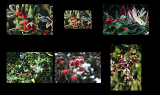

Having now sorted roughly the groups it is clear that some of the pictures are not sitting comfortably with others. The Warwick landscape winter scenes have a good composition, perspective and colour range and sit well but there are only 3 of them. Likewise the winter leaves have a good colour range, perspective. But I particularly like the leaves on the snow. So I am ending with 3 groups as below


Choosing Final Images Theme 1 - Architecture

From the numerous photos taken over recent weeks I now need to get down to the final 10 for post production. the choice is difficult as there are many photos with varied themes and compositions.

But as a start point lets remove the pics that do not sit together in any logical way and try to leave pics which do seem to sit roughly together.

The BT tower, the hands, the bull ring sign all are good but sit alone too much.


The night scenes in Lichfield do not work. I was trying to replicate the work of Ezra Stoller in the black and white pics but the AWB was not correct so they must go. 
What we are getting left with seem to fall into two distinct categories. Old and New !! The stonework of the historical buildings and the shapes they create with very ridgid lines and fairly dull colours, contrast greatly with the shapes and fairly vivid colours of the more modern buildings. 

So lets try to put into two groups. Particularly I was trying with the modern  buildings to replicate the work of Anthony Weller where he creates pictures from details rather than the whole building. He also uses vivid colours to enhance the interest in the picture